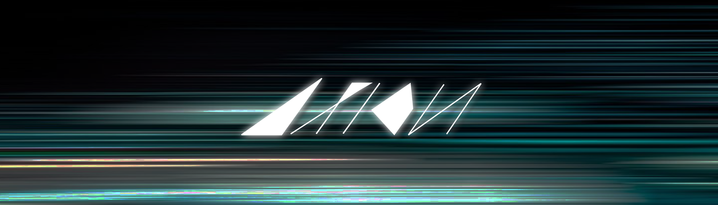
Axion is a type design that explores the intersection of motion, geometry, and rhythm. Inspired by architectural precision and the fluid dynamics of handwriting, it is built on a 55° diagonal system that merges structure with movement. The name combines axis and motion, reflecting a balance of mechanical clarity and human gesture.
TYPE: TYPE DESIGNSOFTWARE: ILLUSTRATOR, PHOTOSHOP-
This project explores how a strict 55° diagonal system can introduce direction, speed, and rhythm into letterform design. The challenge was to express motion through geometry while maintaining structural clarity and visual harmony.
-
Hand sketches established the 55° structure, which was refined digitally through iterative adjustments to spacing, proportion, and angle. The result is a modular display system balancing geometric clarity and motion.
-
By applying a 55° modular system across all forms, Axion achieves a consistent geometric structure while introducing directional motion into each letter.
-
For designers and brands that seek structured, rhythmic, and experimental visual expression.
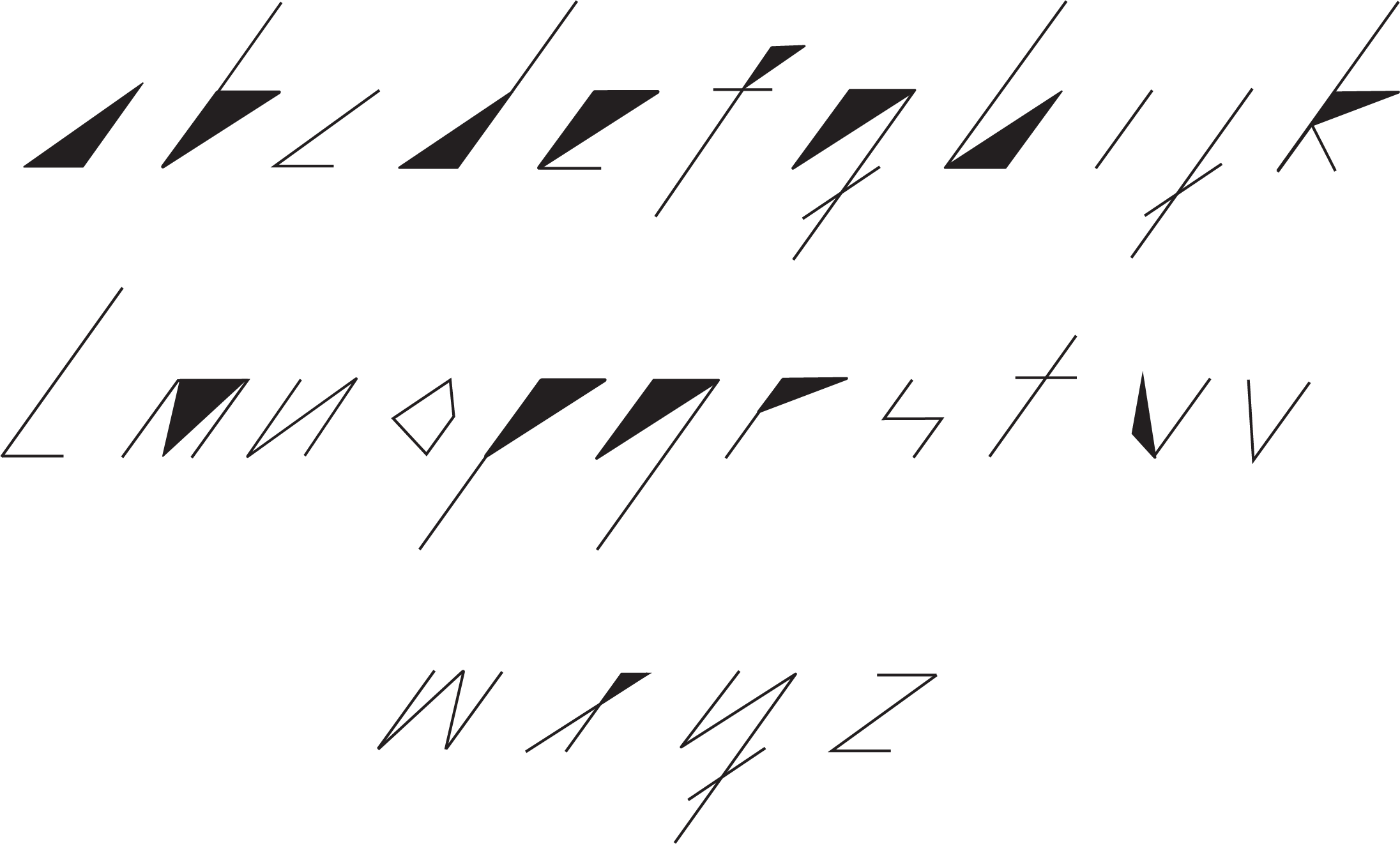
CHARACTER SET
The full Axion alphabet extends the typeface’s diagonal construction system across all forms. Each character follows the same structural logic, resulting in a cohesive set defined by motion, tension, and geometric clarity.
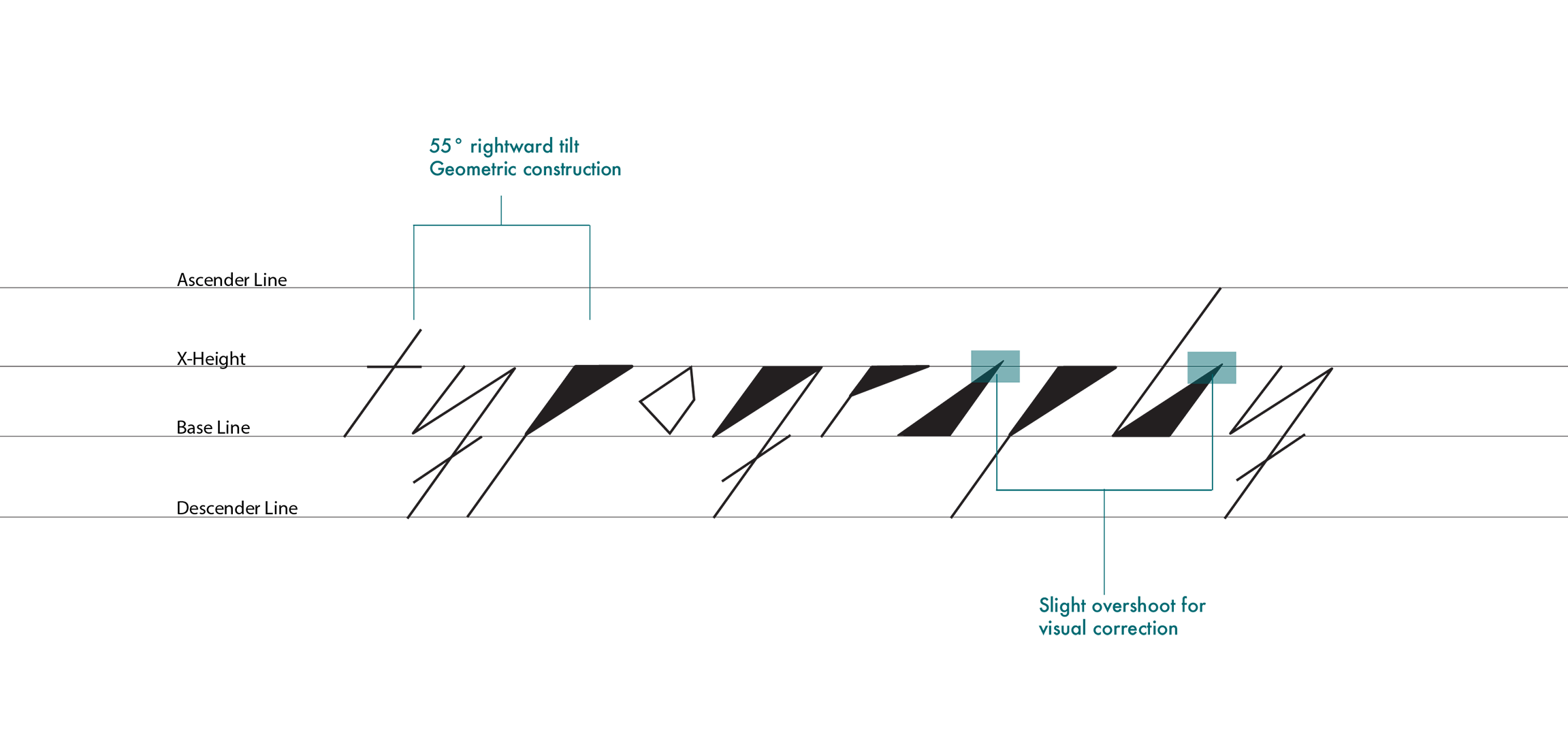
TYPE STRUCTURE
Axion is built on a 55° diagonal framework, using linear and triangular modules to generate each form. Overshoots and optical adjustments refine the geometry, ensuring clarity and balance within the tilted system.
APPLICATIONS
Across print, posters, music, and packaging, Axion transforms movement into visual form, revealing how geometric rhythm can shape identity.
Poster Mockup
— Design Week Poster
This conceptual poster series uses the Axion as both text and form. Its diagonal geometry creates movement and tension, allowing the letters to expand into bold visual structures.
Book Cover Mockup
— Science Fiction book
This sci-fi book cover design centers on the Axion typeface, whose geometric precision and diagonal rhythm evoke a futuristic sense of order and motion.
Vinyl Mockup
— Pink Floyd The Dark Side of the Moon
This redesign integrates the custom typeface Axion with the album’s iconic rainbow arc. The letterforms follow the rhythm of the spectrum, echoing the motion of light and sound to create a renewed sense of harmony and flow.
Packaging Mockup
—Wooden Block Game
Inspired by the geometric logic of the Axion typeface, this packaging design echoes the form and rhythm of tangram blocks. The typography itself becomes part of the game — expressing both its structure and its playful energy.
Poster Mockup
— Racing Poster
This racing poster design utilizes the typeface to amplify the sense of speed and motion. Built on a 55° diagonal system, the typeface naturally conveys direction and acceleration. By aligning its dynamic forms with the visual language of racing and speed, the design transforms typography into movement.