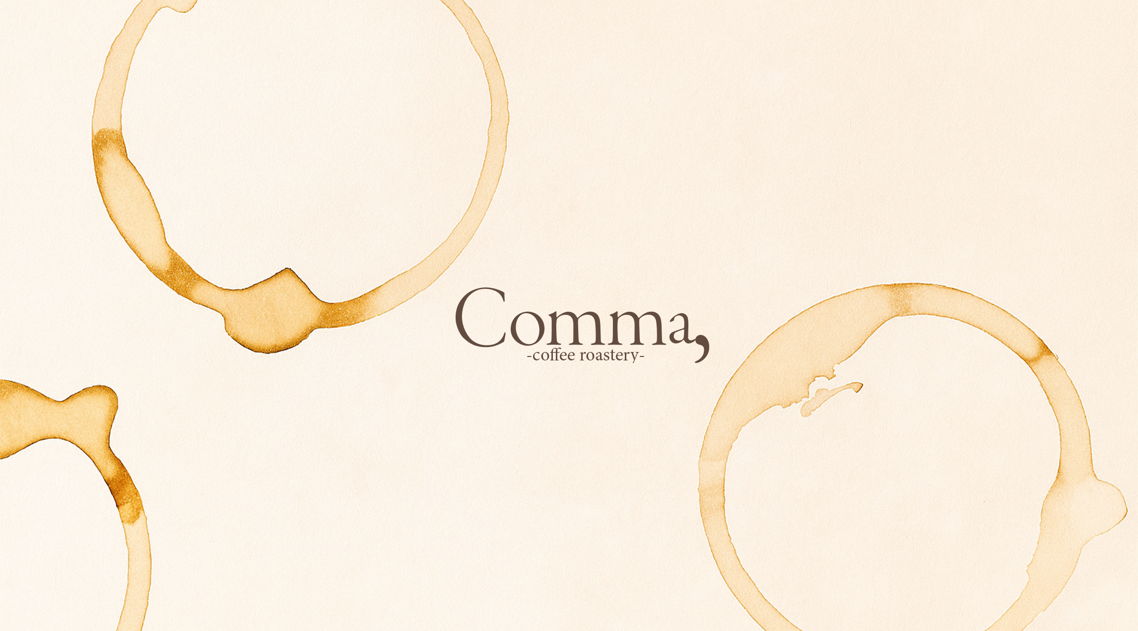
“Comma” is a fictional coffee shop and roastery that crafts quality coffee for those seeking a quiet moment to pause and breathe.
In writing, a comma marks a gentle pause — not an ending.
Our café embraces this idea: in the rush of daily life, Comma is where you slow down, take a breath, and savor the in-between. Designed for stillness and comfort, Comma offers a safe, calming space to study, rest, or simply let your thoughts wander. Here, every cup becomes a small moment to breathe.
TYPE: BRANDING, VISUAL IDENTITYSOFTWARE: PHOTOSHOP, INDESIGN-
Develop a brand identity for a fictional café built around the concept of the “comma”.
The challenge was to visually express this sense of softness and calm across the identity system, creating a brand that feels warm, approachable, and peaceful to its target audience. -
The project began with defining the brand’s core idea and emotional territory. Based on its positioning and target audience, I developed a visual identity system—logo, typography, and color palette—that reflects the brand’s values. The process then expanded into applications and touchpoints, exploring how the identity can grow consistently across future scenarios.
-
The identity centers on the idea of a gentle pause.
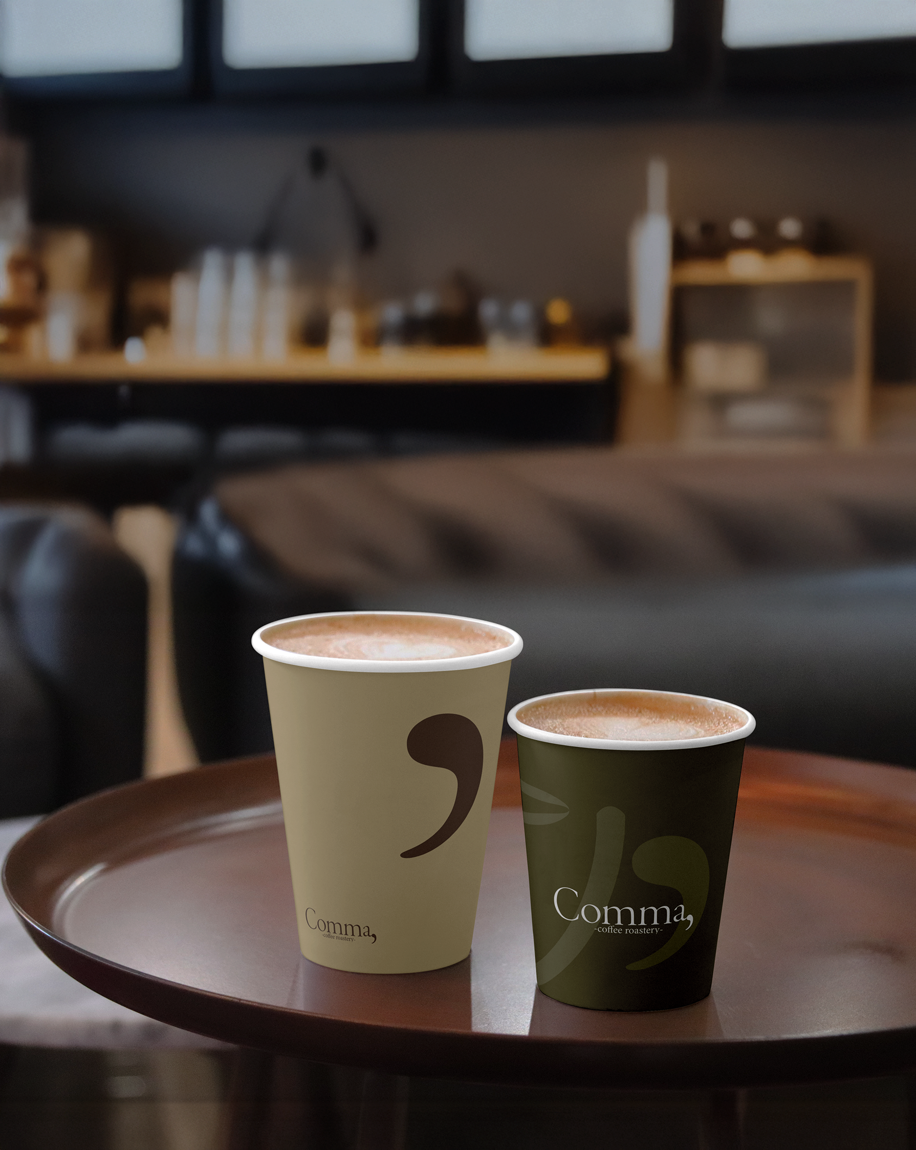
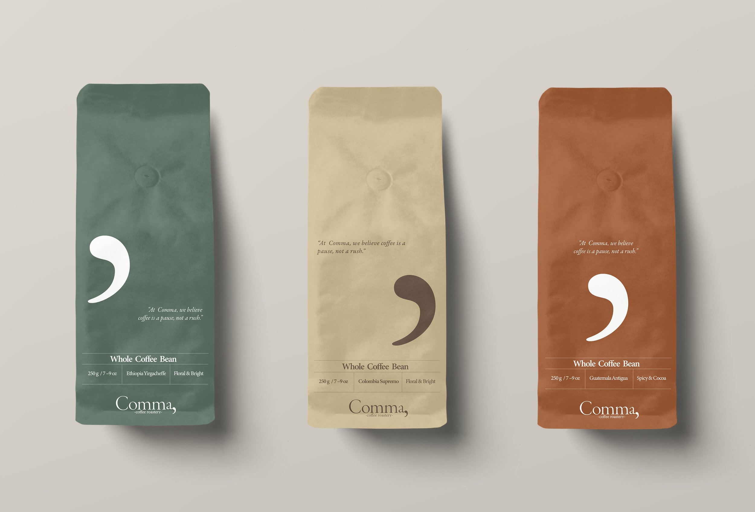
This concept informed every visual decision, from the calm typographic system to the warm, muted color palette. The brand language was then translated into essential café touchpoints, including coffee cups, packaging, and in-store materials, creating a coherent and inviting experience across the entire brand. -
Comma targets young urban professionals, students, and culturally minded consumers who value specialty coffee, thoughtful design, and a quiet space to pause, study, or simply unwind.
VISUAL IDENTITY
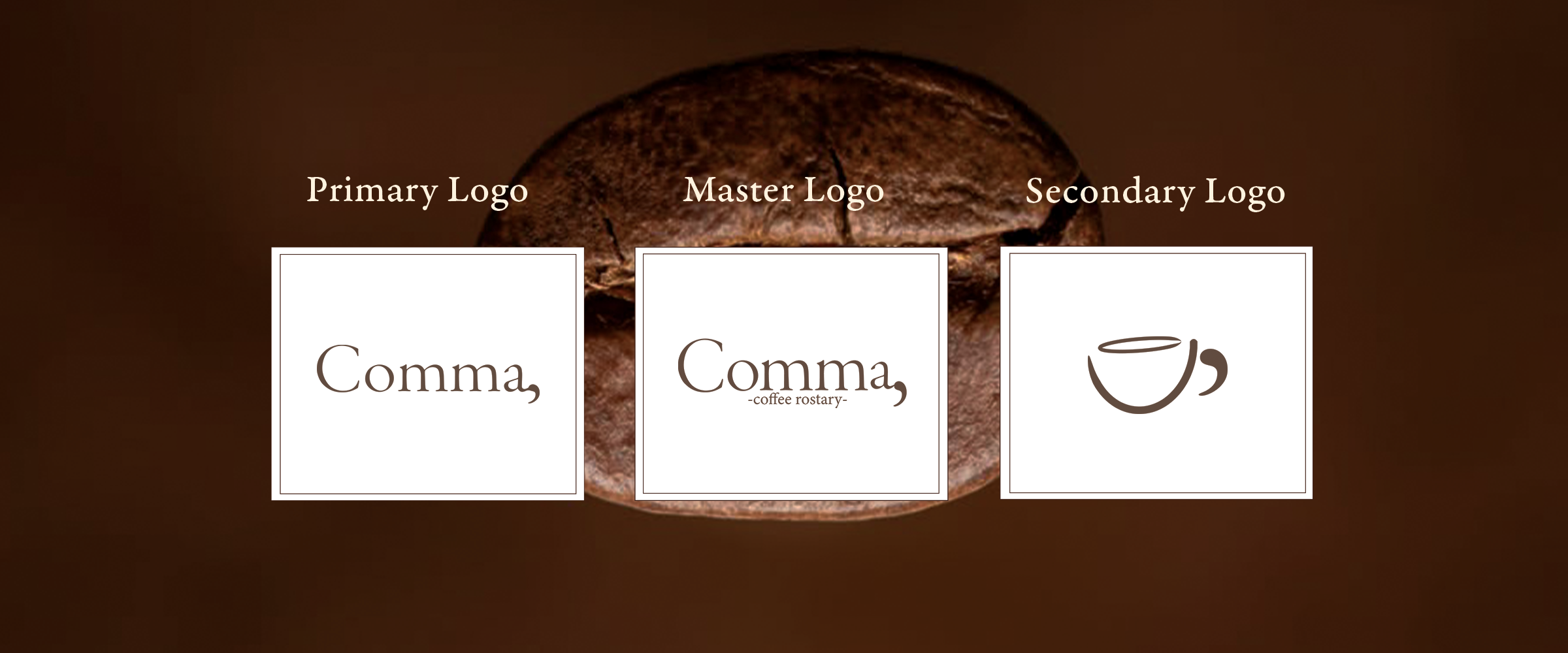
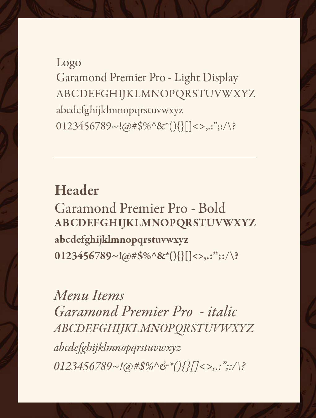
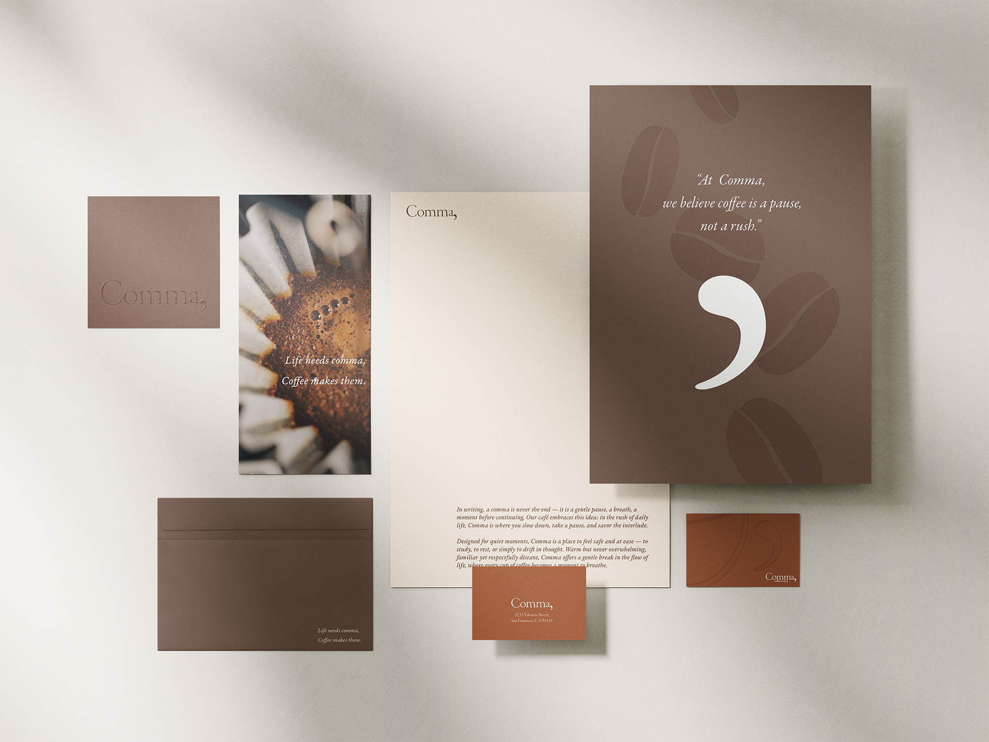
The visual identity of Comma centers on quiet elegance and the idea of a gentle pause. The logotype uses Garamond Premier Pro with a custom comma mark, tying the brand concept directly into its form.
A structured logo system—primary, master, and secondary—supports different touchpoints with clarity and consistency.
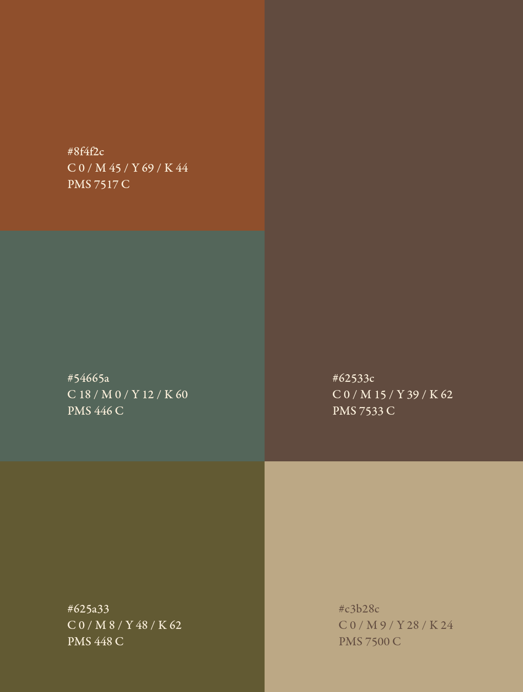
Warm browns, soft beige, and a touch of orange create comfort and warmth, while teal and olive add calm balance. Together, the palette and typography build a warm, refined, and quietly expressive identity.
PHYSICAL TOUCHPOINTS
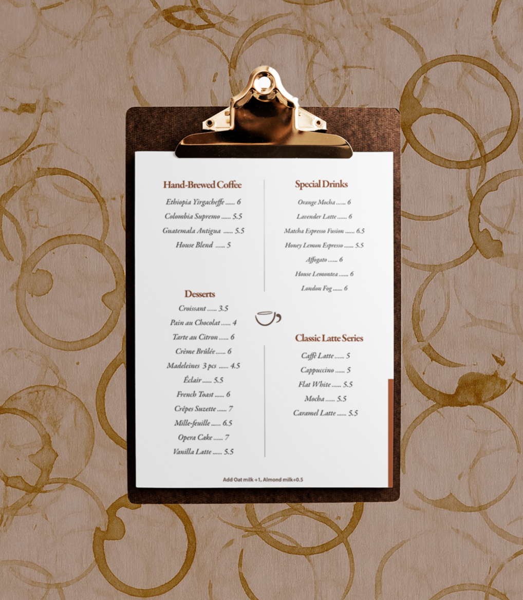
Comma’s physical touchpoints offer the most immediate way for customers to feel the pause at the heart of the brand. From the wooden door stand that greets you to the cup that travels with you, each element turns a gentle break into something tangible.

DIGITAL TOUCHPOINTS
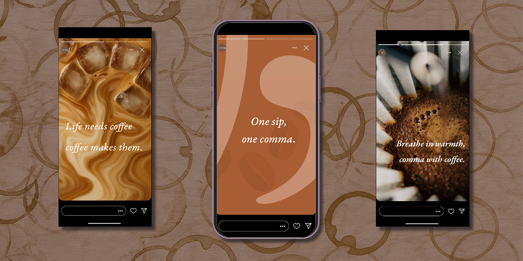
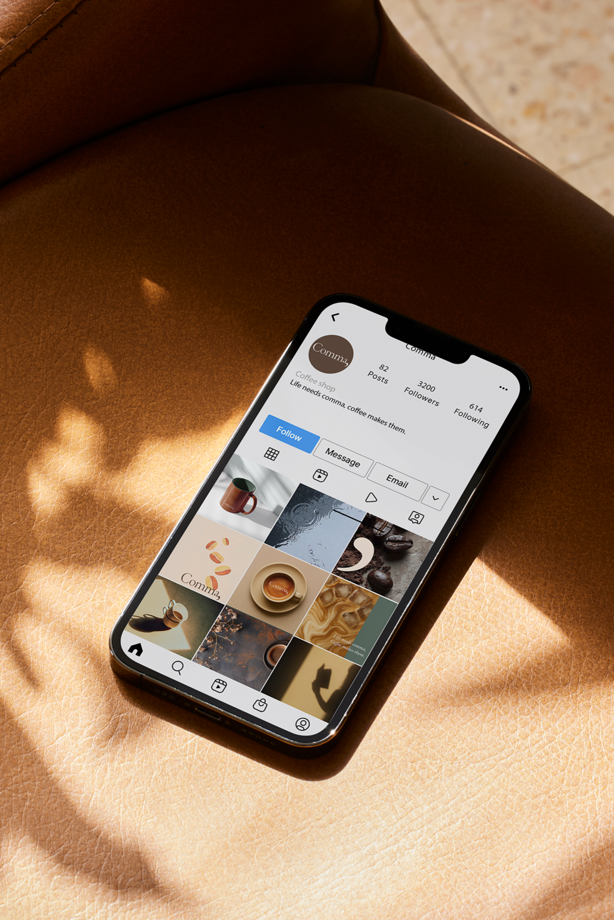
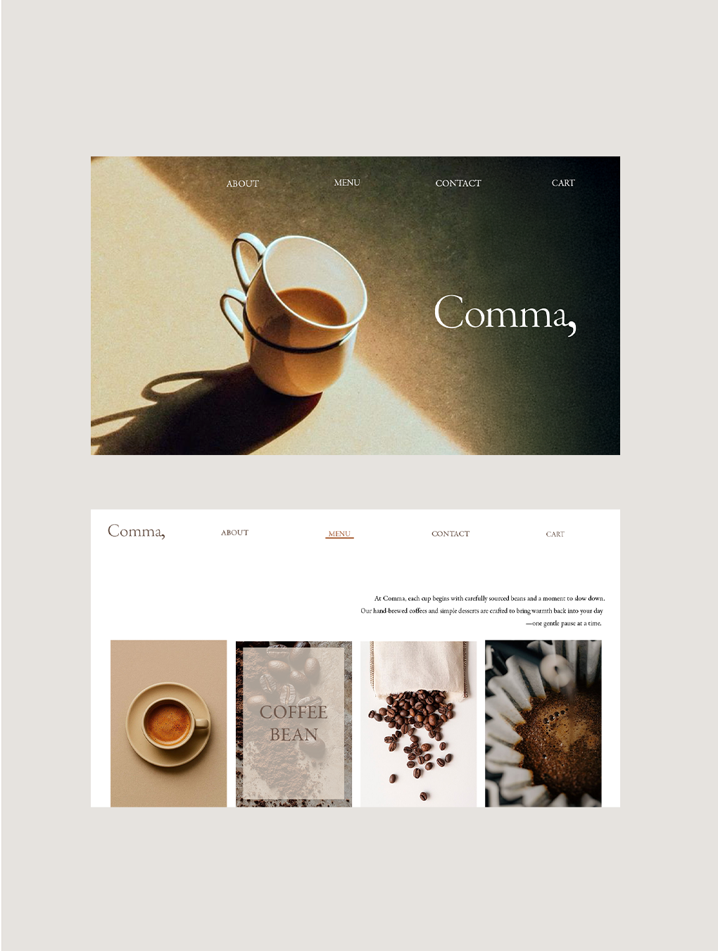
The digital touchpoints extend Comma’s idea into an online space.
Through soft tones, natural light, and atmospheric imagery—from rain-soaked moments to gentle morning shadows—the brand’s pause becomes a visual experience.
MERCH
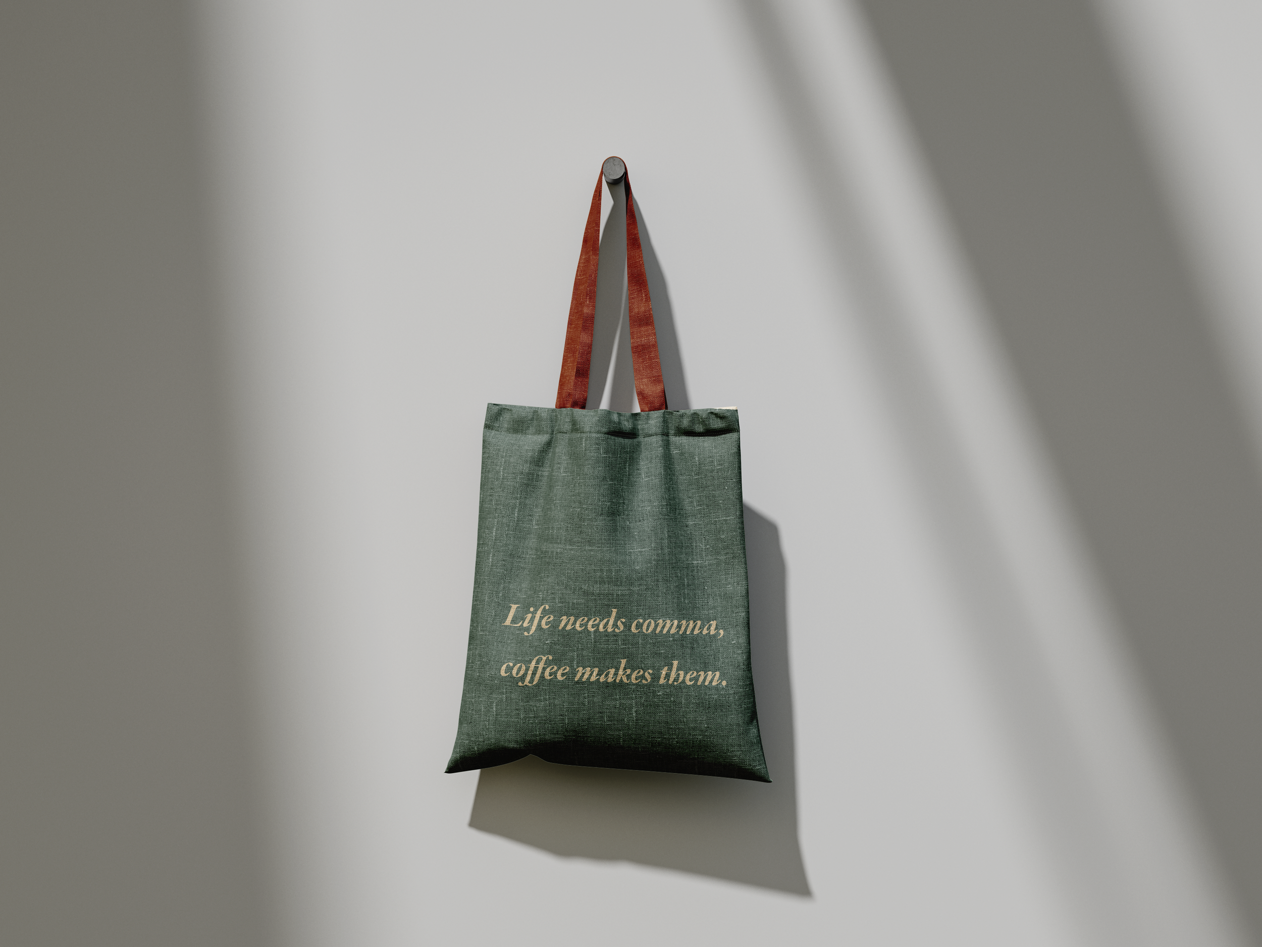
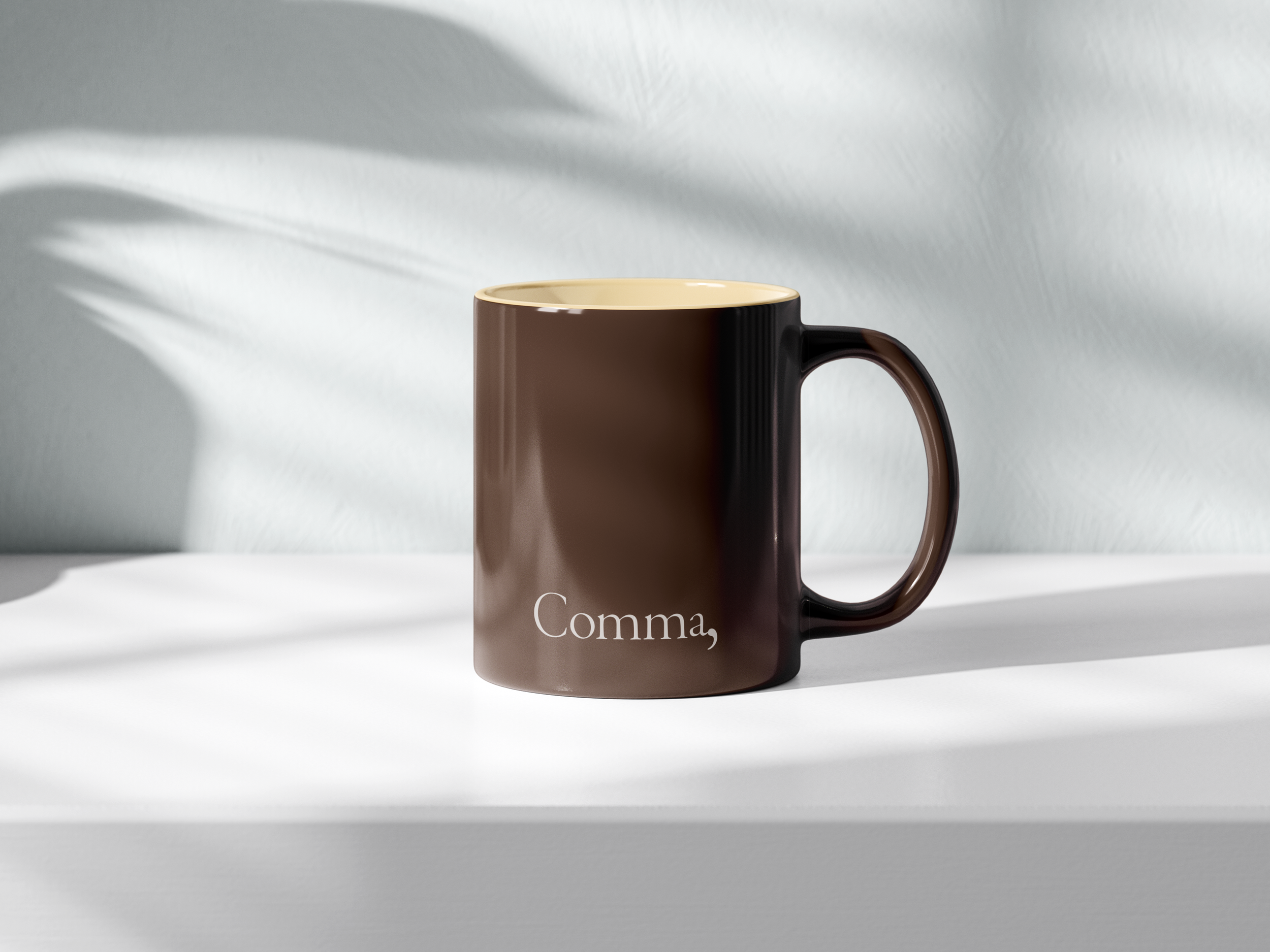
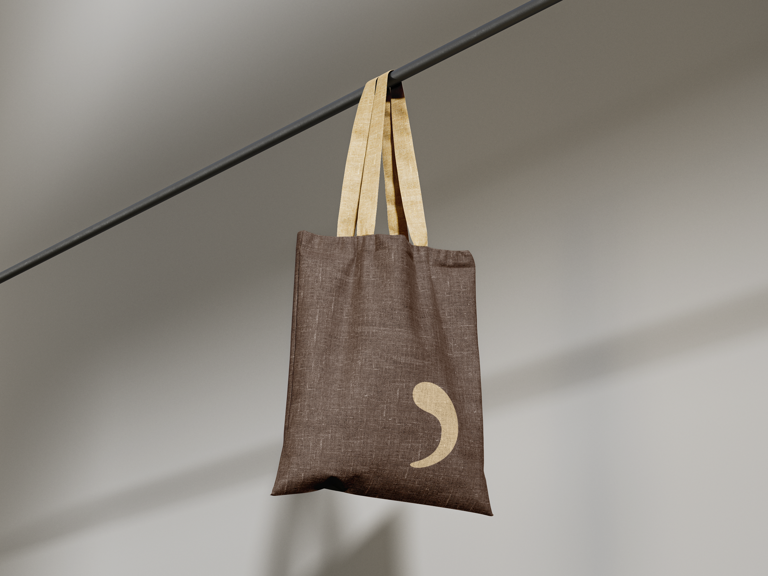
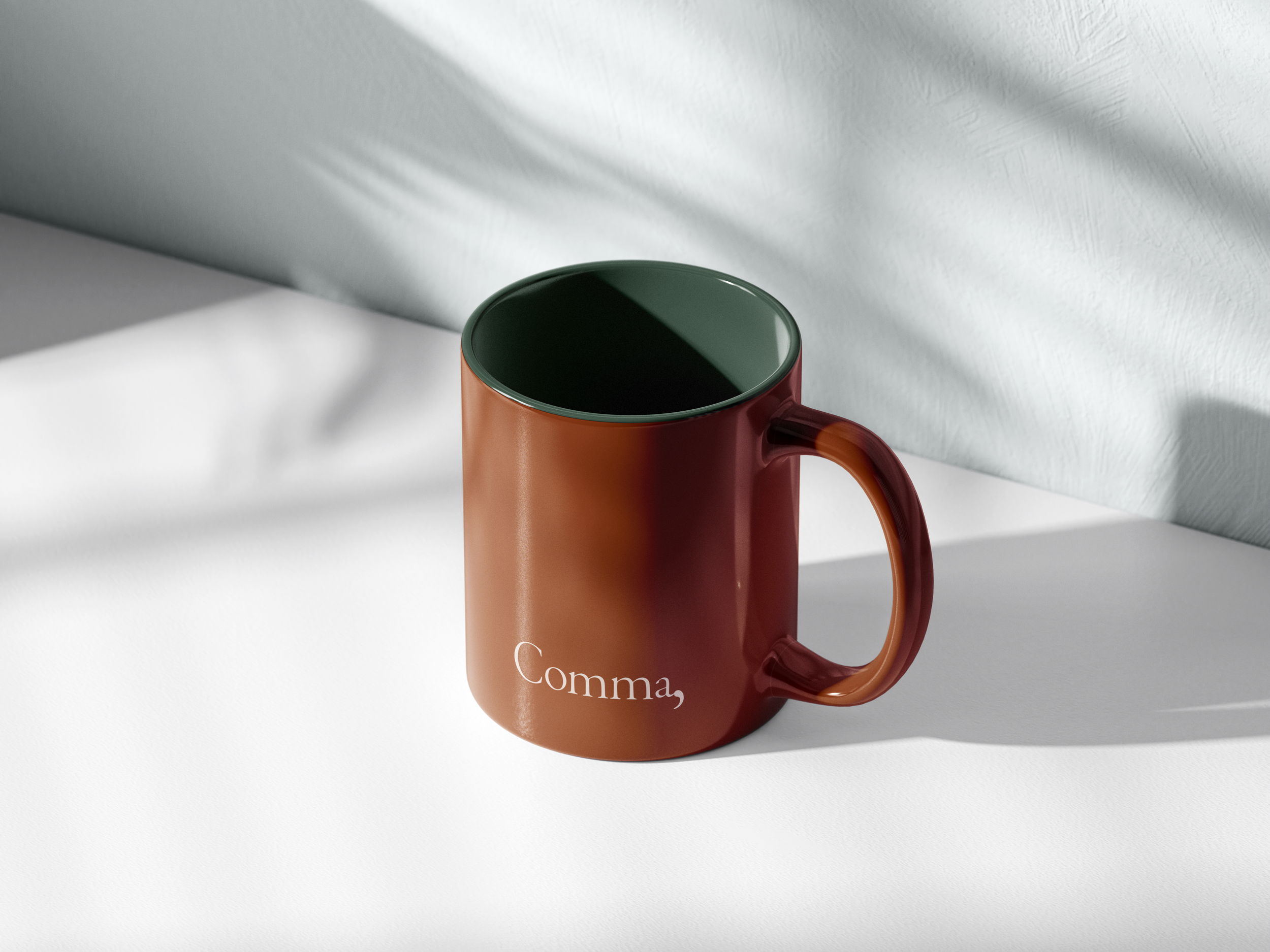
Comma’s merchandise brings the brand’s softness into daily routines. Each piece holds a quiet warmth—simple, familiar, and made to feel comforting in the hand.