“Designing Life” is a fictional conceptual magazine that explores how design extends beyond objects and aesthetics—into the way we think, live, and structure our everyday existence.
Rather than focusing solely on design products, it investigates how we design our way of living: from the spaces we inhabit, to the choices we make, and the emotions that shape our routines. Each issue centers around a specific theme that connects design philosophy with real-life sensibility.
TYPE: EDITORIAL, PRINT DESIGNSOFTWARE: INDESIGN, PHOTOSHOP-
Design today often focuses on objects, styles, and aesthetics, while overlooking the deeper question of how design shapes the way we live. “Designing Life” explores this gap—examining how design extends beyond objects and aesthetics—into the way we think, live, and structure our everyday existence. .The project seeks to reconnect design with its lived context, offering a publication that sits between lifestyle reflection and design thinking.
-
The visual direction began with the idea of creating a magazine that feels contemplative, warm, and quietly thoughtful. I developed moodboards around natural light, soft shadows, and understated layouts, drawing from lifestyle photography and clean editorial compositions.
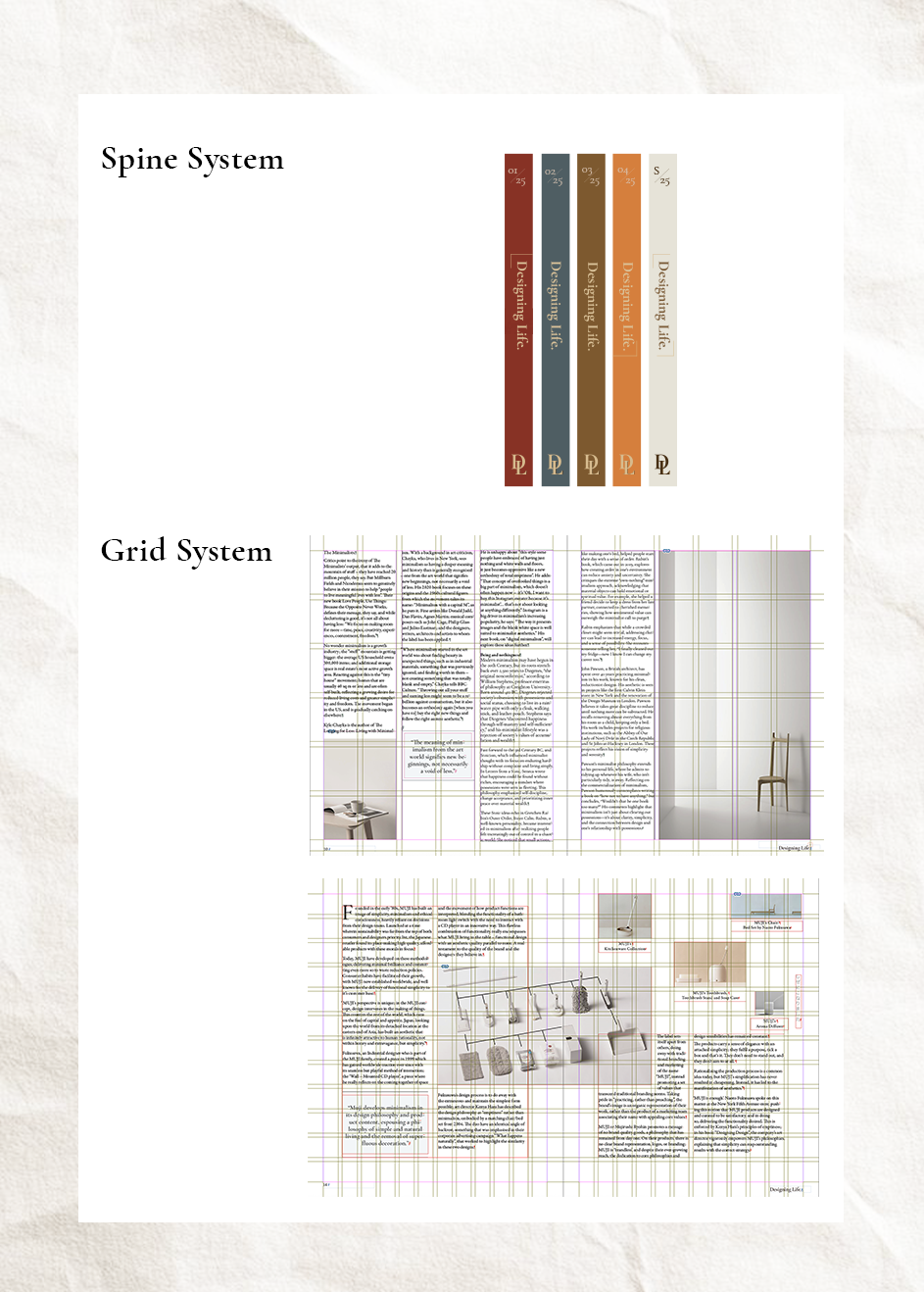
A grid system was established early to ensure clarity and rhythm across issues. Photography and color palettes were curated to evoke calmness: muted tones, gentle contrasts, and familiar everyday scenes that reveal subtle beauty.
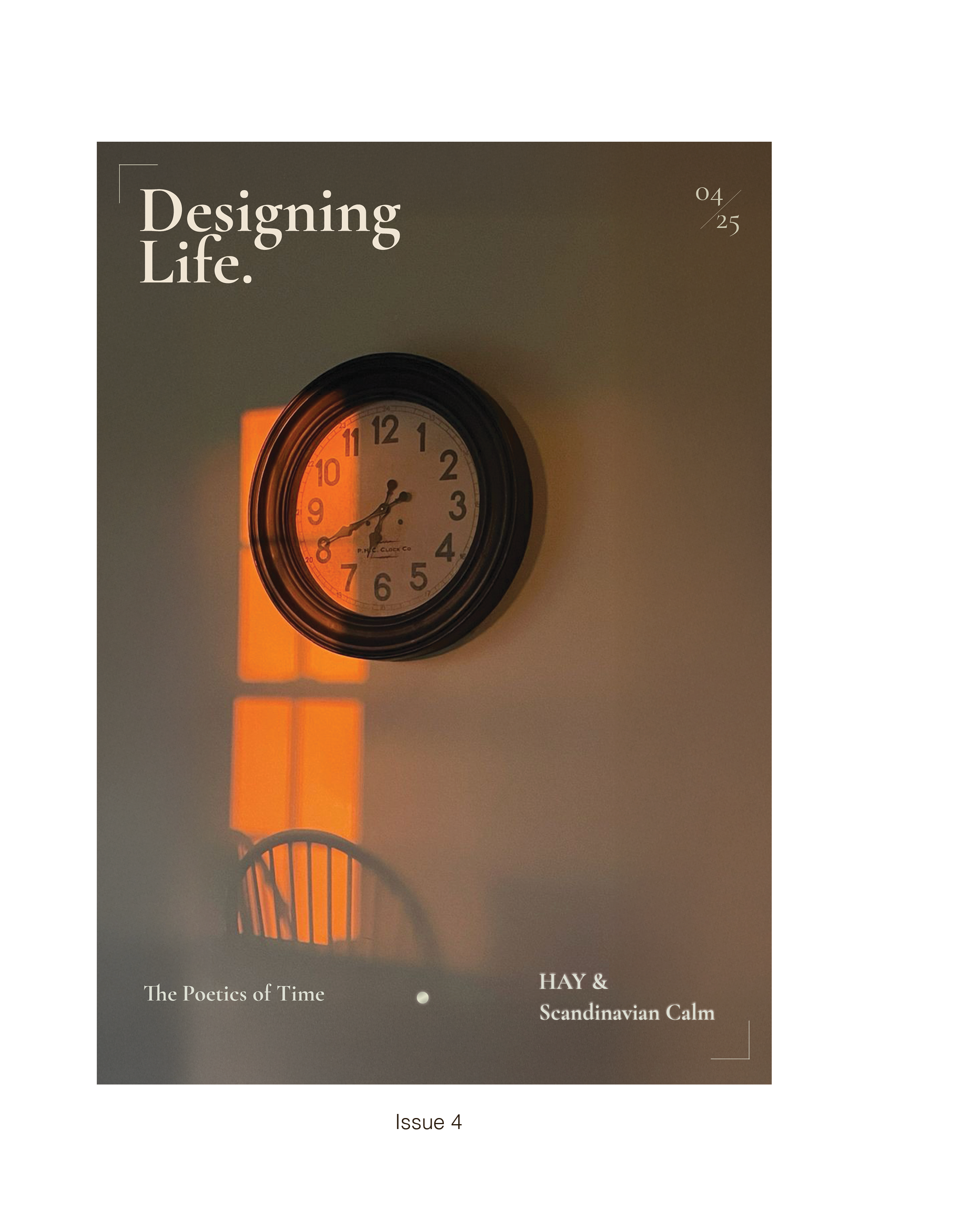
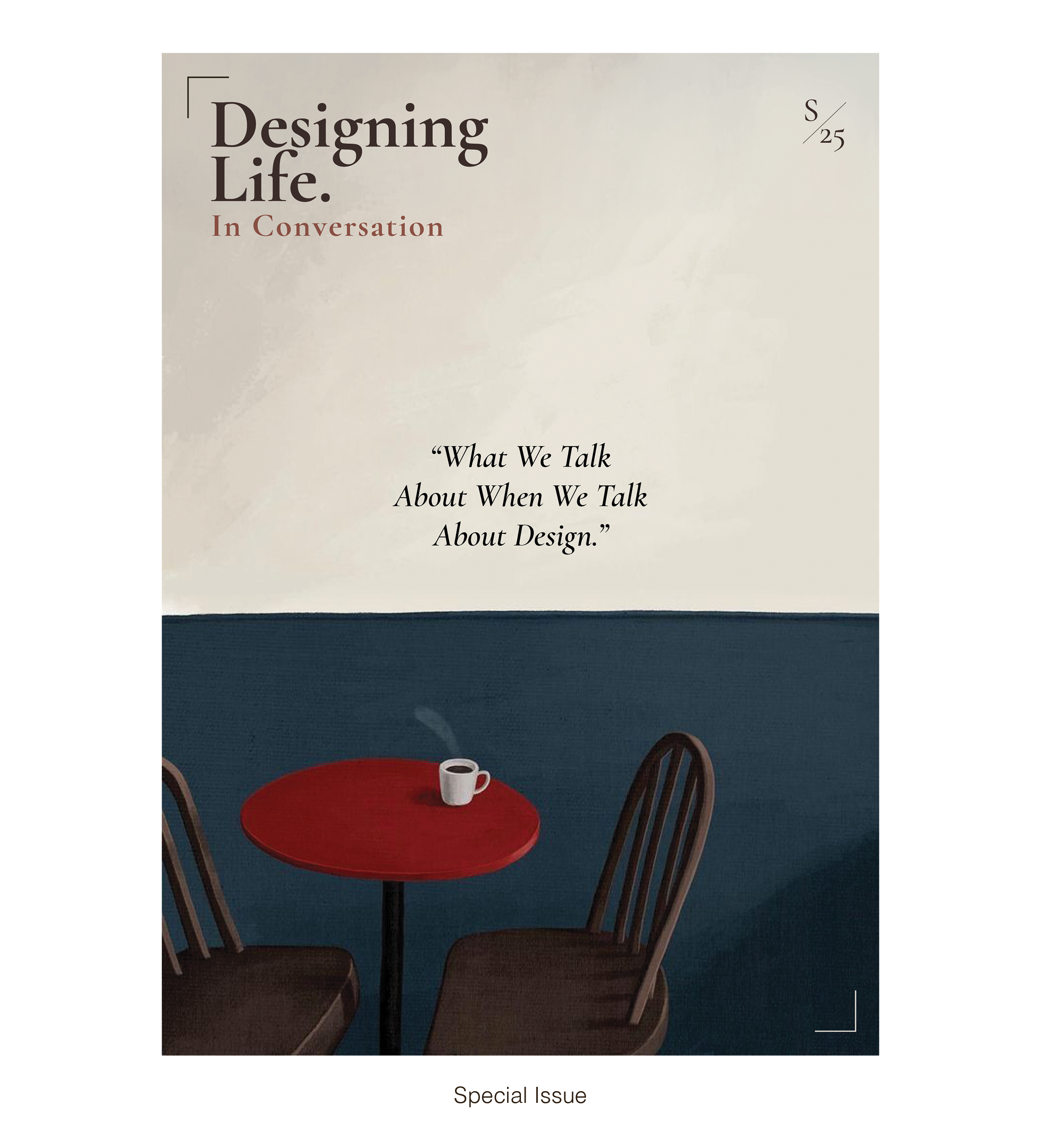
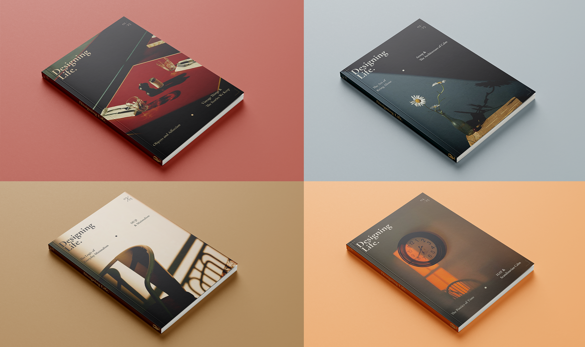
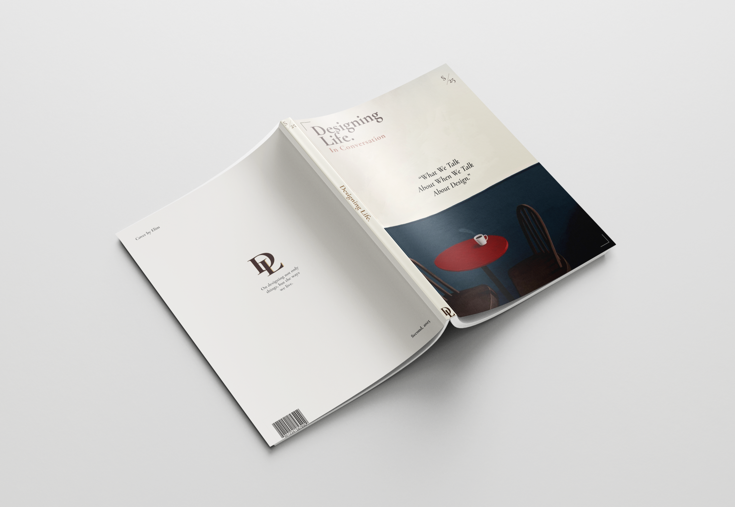
The magazine consists of four seasonal issues and an additional special edition each year, with slight variations in layout and tone to reflect thematic shifts. -
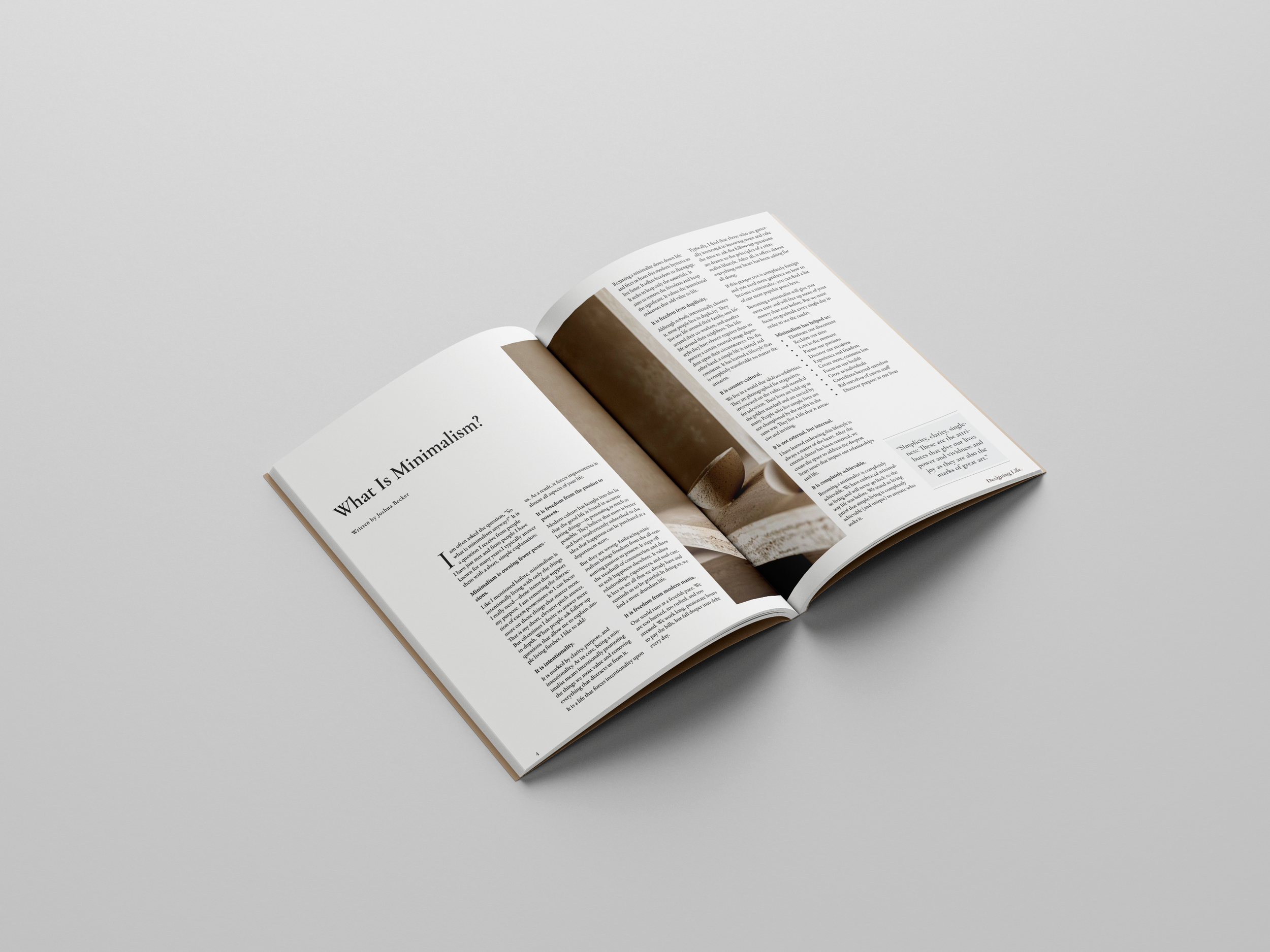
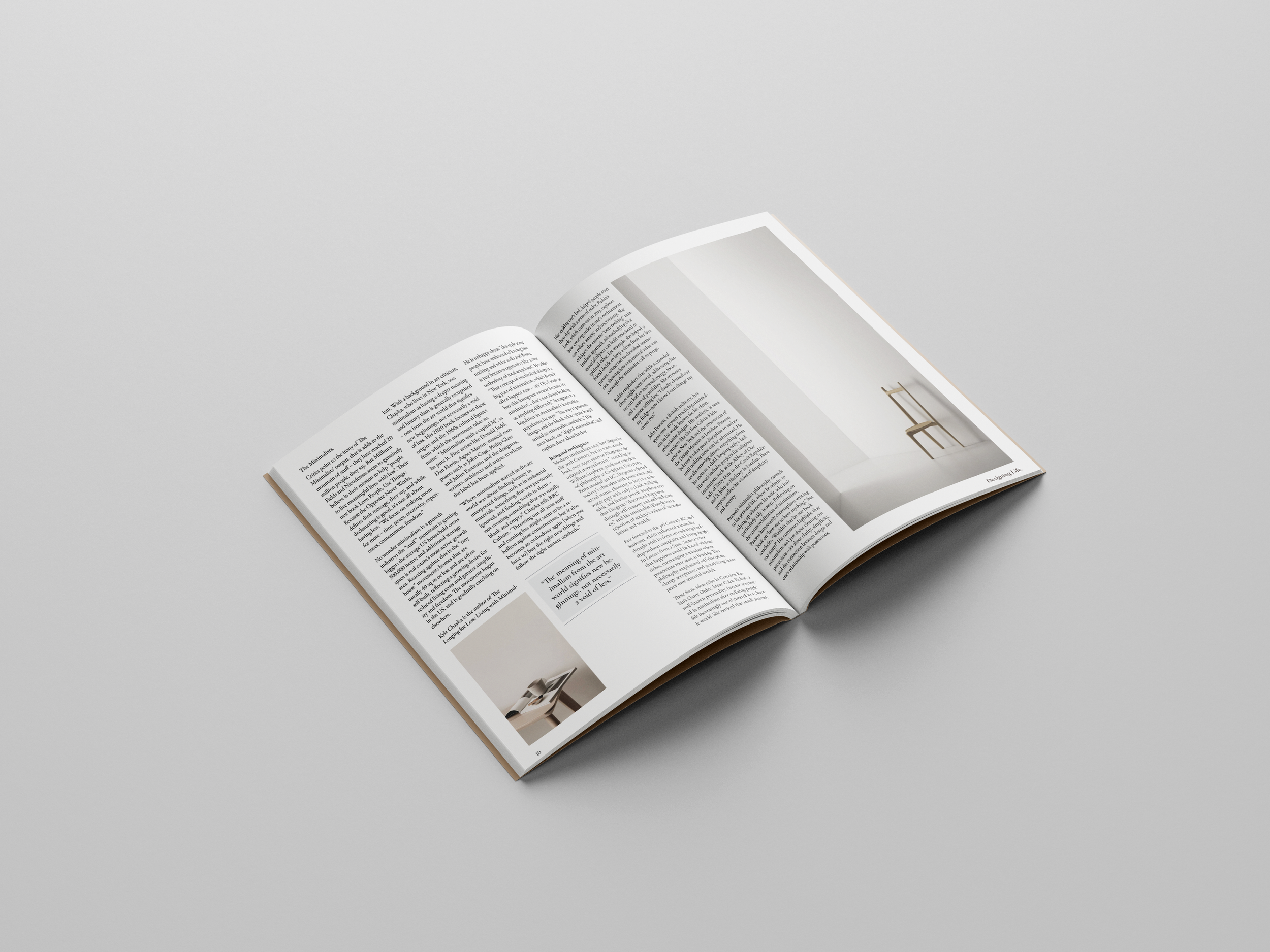
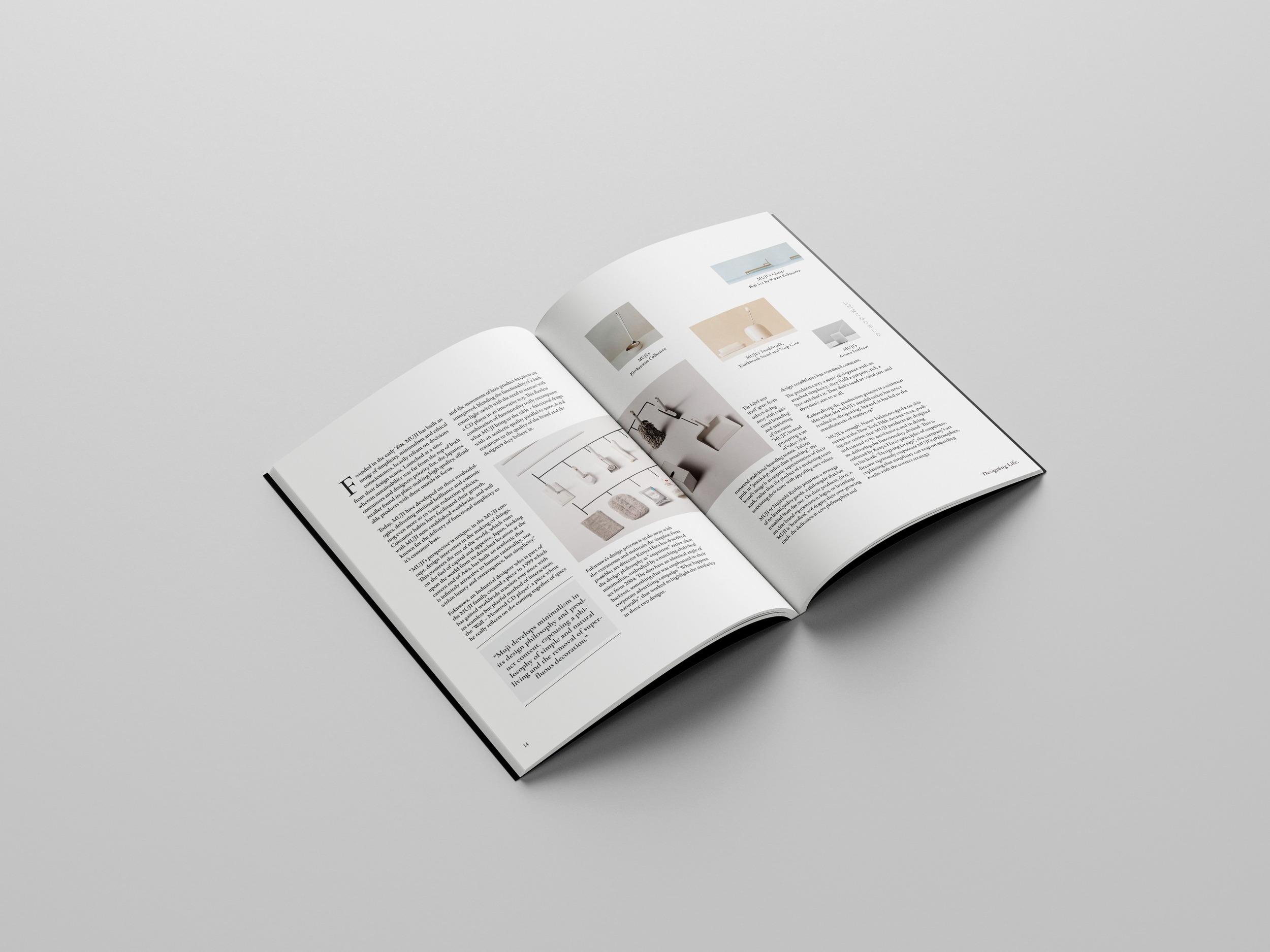
The solution is a conceptual publication that merges design philosophy with lived experience. Each issue uses quiet imagery, restrained typography, and spacious layouts to create room for reflection. Light and shadow play a central visual role, grounding the reader in moments of daily life while opening up space for interpretation.
-
Readers interested in lifestyle aesthetics, slow living, and the intersection of design, emotion, and everyday experience
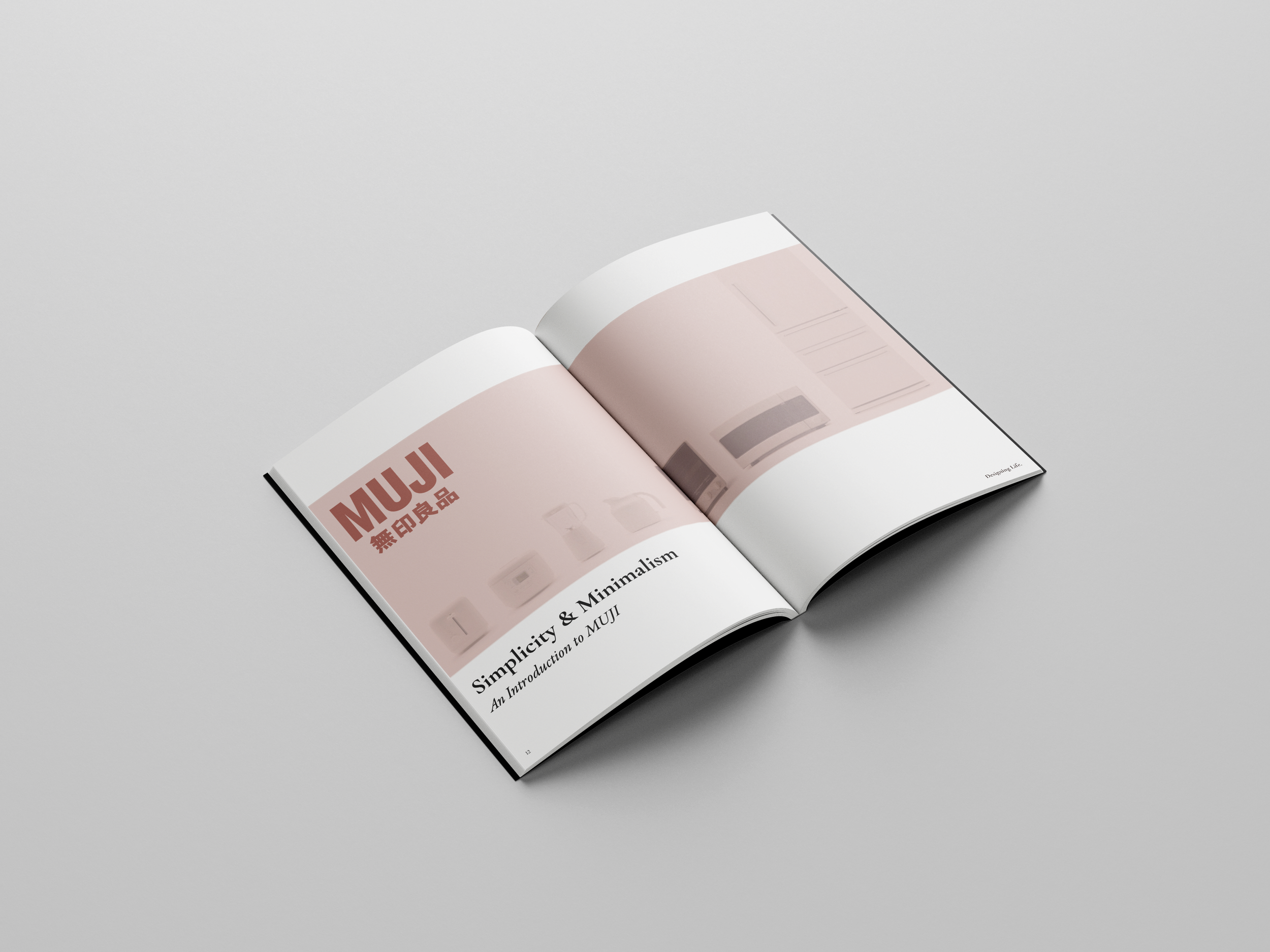
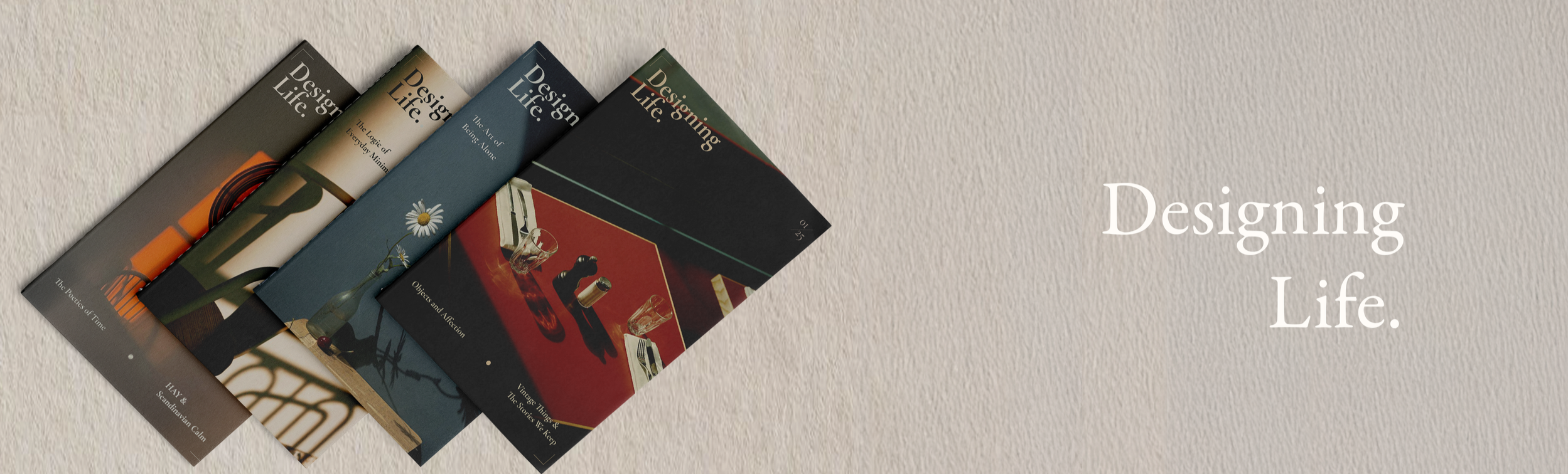
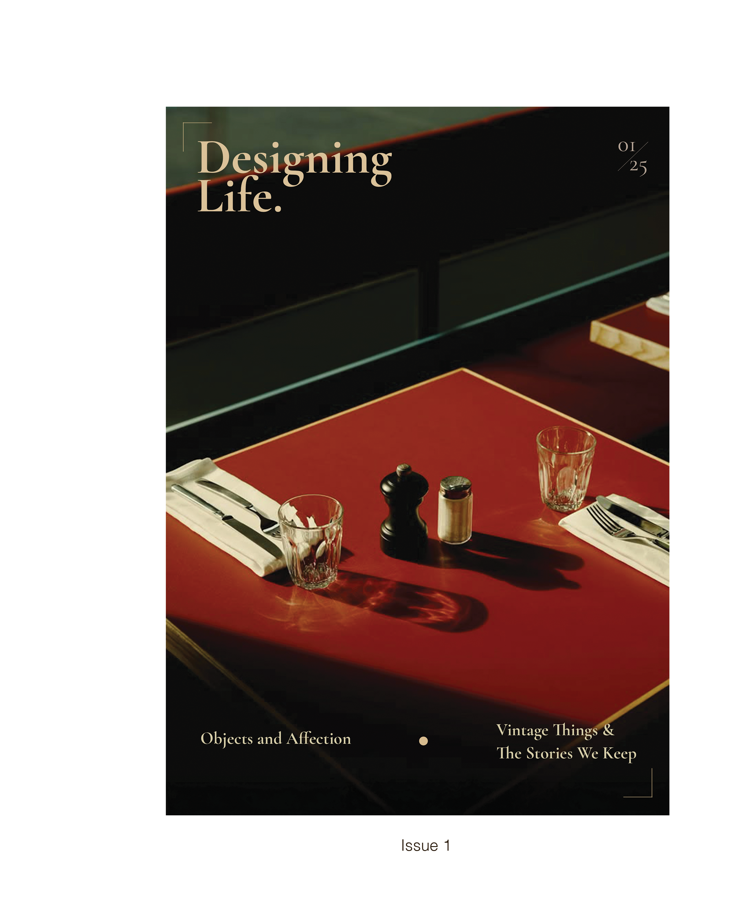
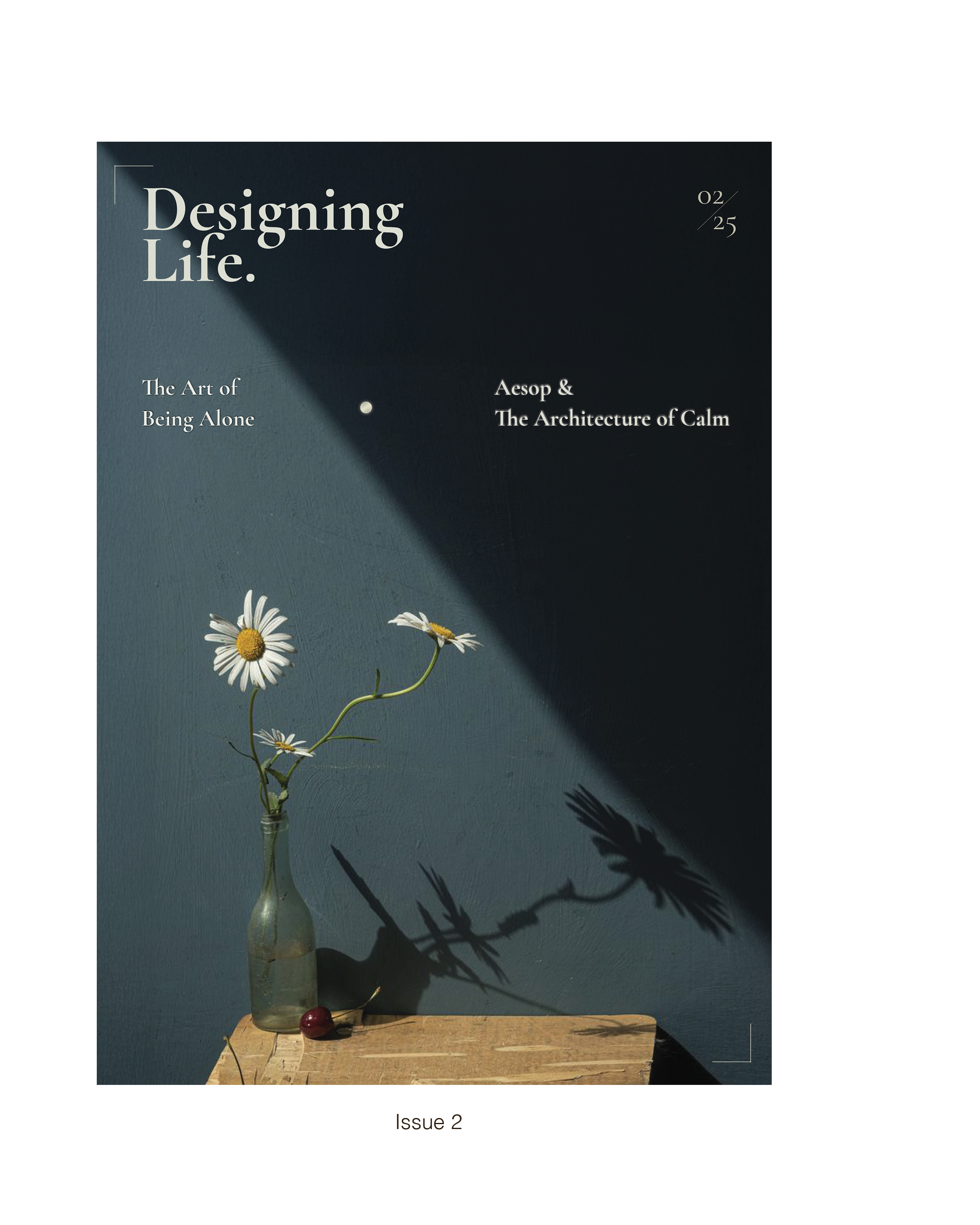
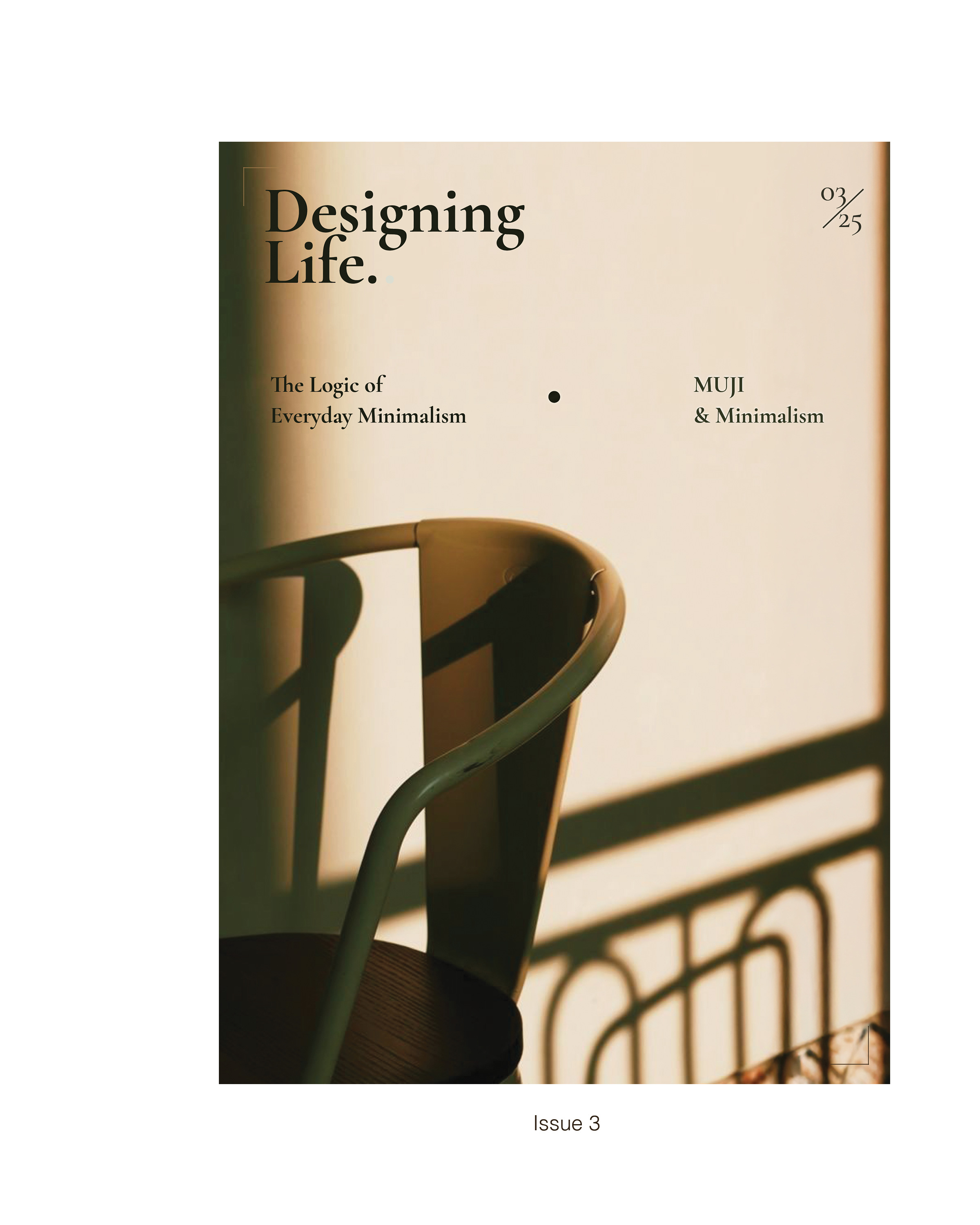
COVER COLLECTION
Each issue is designed with a calm, reflective tone—using everyday scenes, natural light, and understated typography to express the theme of each season. Across the four core issues and the annual special edition, the cover system maintains a consistent identity while allowing subtle variations in tone and mood.
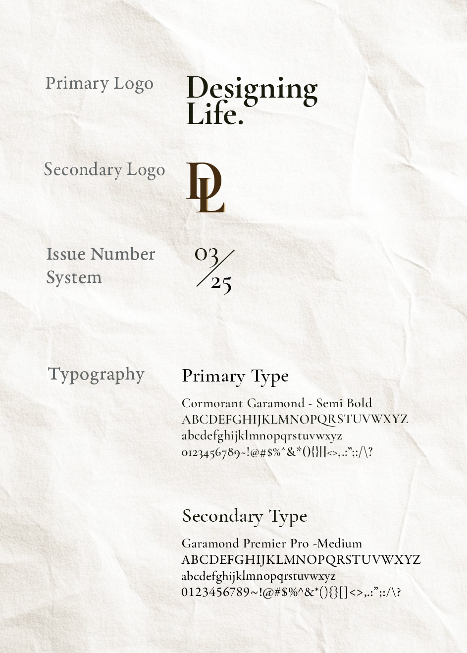
VISUAL SYSTEM
The visual system combines a serif-led typographic hierarchy, a consistent issue-number structure, and a color-coded spine system to create a calm, literary identity. A flexible multi-column grid supports both text-heavy and image-driven layouts, ensuring clarity and cohesion across all issues.
INSIDE PAGES
The inside pages follow a calm, spacious editorial rhythm—balancing text, photography, and white space to create an atmosphere of clarity and reflection. Each spread is designed to guide the reader through ideas gradually, using understated typography and consistent grids to maintain a clean visual structure across features.