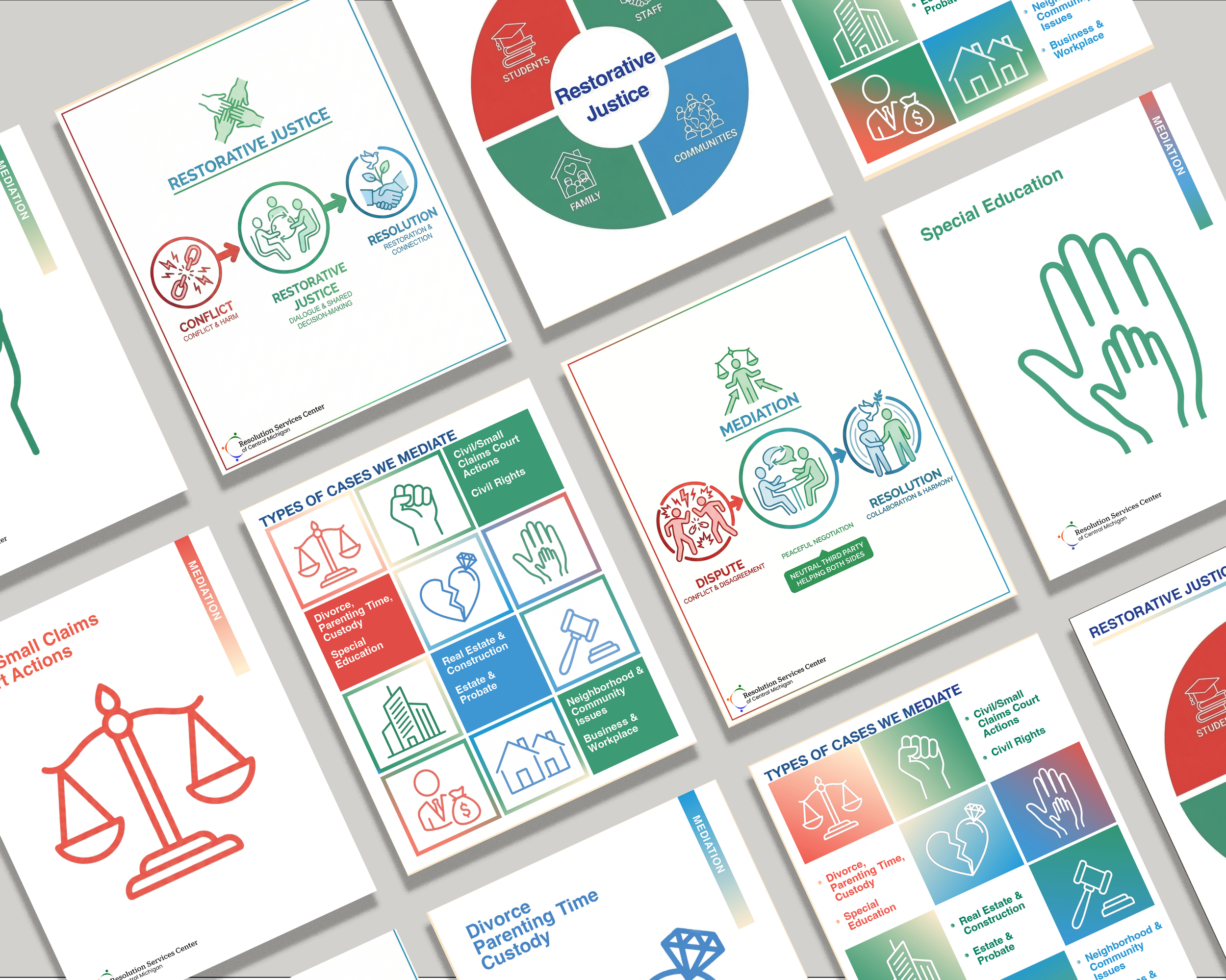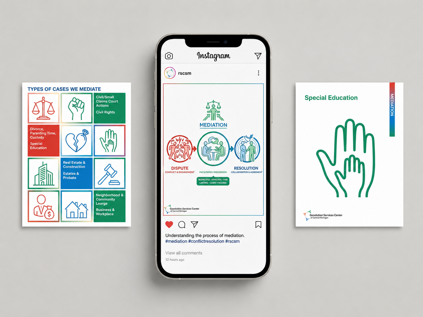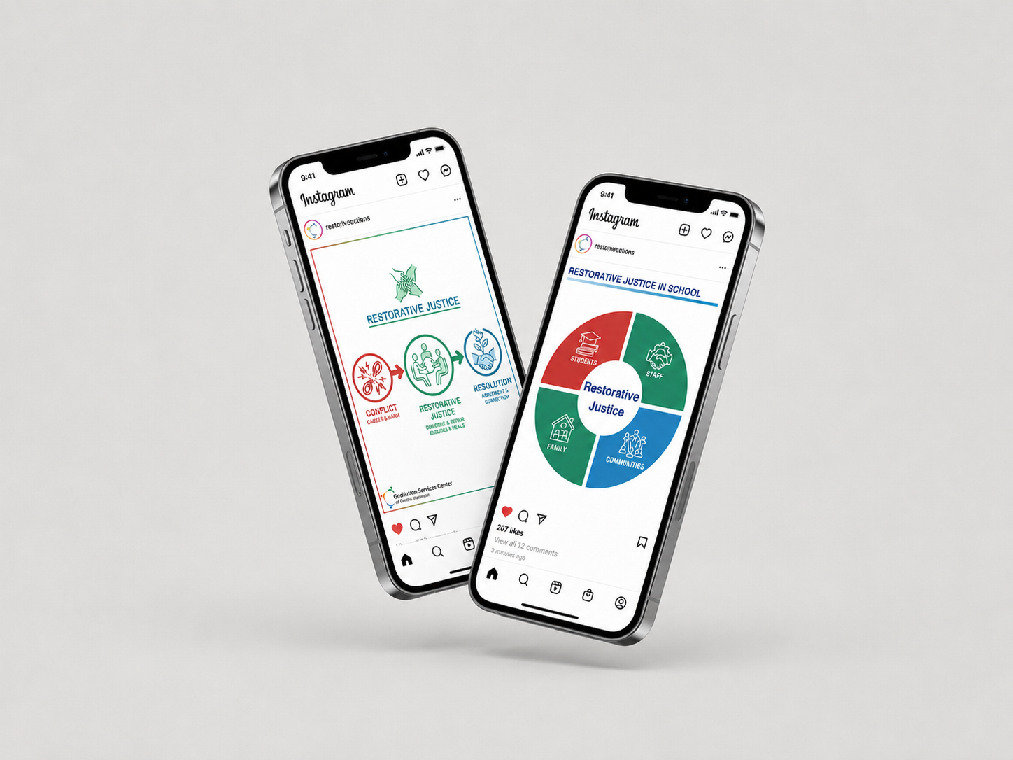
A social graphics system for a nonprofit conflict resolution center, using icon-based diagrams to make two of their core services—restorative justice and mediation—instantly understandable, along with the specific service categories within each, across both print and Instagram formats.
TYPE: GRAPHICS DESIGN
SOFTWARE: PHOTOSHOP
CLIENT:RESOLUTION SERVICES CENTER OF CENTRAL MICHIGAN
-
The client, a nonprofit conflict resolution center, needed graphics primarily for social media—visuals that were shareable and easy to grasp at a glance, while still preserving the seriousness of their work. With no existing icon system, they also needed to show the specific service categories within restorative justice and mediation, usable across both social and print formats.
-
The three-color system extends the client's existing logo palette, which also happened to map naturally onto mediation's three-party structure—letting color reinforce both brand identity and process logic at once. Each service area became a three-stage diagram (conflict → process → resolution), rendered in a simplified icon style approachable enough for social media, without undercutting the seriousness of the work.
-
Figures were rendered as simple circular line-art icons paired with clear text labels, letting viewers grasp each service at a glance. Gradients were added across the icon set to keep the graphics visually engaging across both Instagram and print formats.
-
Local community members unfamiliar with mediation as an alternative to litigation—often people already in the middle of a dispute, custody matter, or workplace conflict.